
從 b2evolution 轉移到 wordpress 的過程,吃足最大苦頭的不是轉檔 (migrate),而是版面的 CSS 設計。
這一次我對版面的需求一開始就打算使用三欄式的 Layout 了,原因是我打算提供更多樣化的一些額外附屬資訊,同時現在是流行大螢幕尺寸,1024*768 以上的瀏覽畫面,已經佔絕大部分使用者的比例了。 我的版面構思是右邊兩側為 Sidebar 列,一個稍寬、另一個稍窄 (均可調整寬度),左側就是內容 (content) 主頁了。 然後 Sidebars 是設成固定寬度 (fixed-width),而內容區則可以視瀏覽器寬度的大小而變動 (Liquid-layout)。
當然一開始是透過諸多提供 wordpress 佈景主題 (theme)網站來找尋,結果花了一整天的時間,瀏覽了數百個佈景主題,就是找不到我心中所想的,絕大部分的 CSS Layout 均是採用固定式寬度的設計;再則,我似乎有一些 "潔癖",看到 style.css 編輯得很凌亂,就挺不舒服的。 後來決定了,自己重寫 css layout! 我甚至不是 copy 自 default 的 css 當成樣板,而是僅把它當成參考,然後逐漸地邊嘗試、邊摸索,一點一滴試到可以接受為止。
事實上,我發現到,如果 sidebar 與 content 都是可變動的比例式或為固定寬度,那麼 layout 就挺好設計的。 但是像我這樣的需求,反而比想像得還要困難。 更重要的是,我其實不太會 CSS,我是在這一次為了達成我理想中的版面,才去瞭解一些基礎觀念。 版面 CSS 的設計,最基本的就是對所謂的 "Box Model" 要能有清楚的理解才行。起碼你總要知道 margin 與 padding 的差異、float 與 position 的浮動調整,以及還要注意的是 IE 與 Firefox 兩者瀏覽器(及其版本) 的支援程度才行。 這裡我強烈推薦 網站製作學習誌 這個網站, 版主在其一篇:CSS 排版觀念—Box Model ,寫得非常清楚,是一篇相當棒的教學文。
仍然又是透過我的好朋友 Google,查詢到了能達成我理想中版面的 CSS 解法,起碼有三種方式可以達成。 我這裡也不想去比較各種方式的優劣與否,大致上就是作個整理,有興趣的網友們可以去行參考。
- CSS 速戰速決 - 談多欄式編排。
- 樂多Blog排版入門。
- Two-Column Liquid Layout。
- The 'Blog Style' 3 column Liquid Layout (Pixel-widths)。
反覆嘗試,我是採用了最後這一個,"The 'Blog Style' 3 column Liquid Layout (Pixel-widths)" 。 這個版面的 CSS Layout 設計可以說是相當古怪 ( 簡單的說,它利用一個 200% 的 parent 區塊再折成只有右側 100% 來包含 content 區塊。)、也最複雜,但相對也是最具彈性,無論你用 IE or Firefox or 其它各類瀏覽器,無論你怎麼伸縮,版面真的是不會跑掉 (如側邊欄掉下問題)。
不過,我有做了一些調整。 如果三欄式的兩個 Sidebar 是放在同一側,那麼,我就把它視為是一個 "大" 的 Sidebar (parent),其內在包兩個左右 "小" 的 Sidebar (child)。 如此我是覺得無論這個大的 sidebar 內部怎麼變化,都是它自己的事,所以也可以任意調整內部甚而再加上 "上與下" 的 sidebar 列了。
怎麼實現最好呢? 就是把 html 與 css 都寫在同一個 html 檔內,然後打開 IE 與 Firefox,同時去測試比較寫出來後的效果。 對了,我強烈建議,一定要安裝 Firefox 的 Plugin: Firebug, 真是太好用了! 如此要能追蹤除錯,相當地方便。
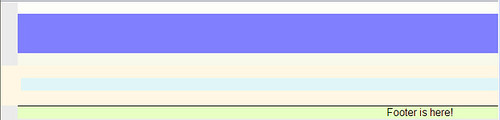
我這裡也列出我原先所寫得這一個 css layout template 檔案:
1 2 3 4 5 6 7 8 9 10 11 12 13 14 15 16 17 18 19 20 21 22 23 24 25 26 27 28 29 30 31 32 33 34 35 36 37 38 39 40 41 42 43 44 45 46 47 48 49 50 51 52 53 54 55 56 57 58 59 60 61 62 63 64 65 66 67 68 69 70 71 72 73 74 75 76 77 78 79 80 81 82 83 84 85 86 87 88 89 90 91 92 93 94 95 96 97 98 99 100 101 102 103 104 105 106 107 108 109 110 111 112 113 114 115 116 117 118 119 120 121 122 123 124 125 126 127 128 129 130 131 132 133 134 135 136 137 138 139 140 141 142 143 144 145 146 147 148 149 150 151 152 153 154 155 156 157 158 159 160 161 162 163 164 165 166 167 168 169 | <!DOCTYPE HTML PUBLIC "-//W3C//DTD XHTML 1.0 Strict//EN" "http://www.w3.org/TR/xhtml1/DTD/xhtml1-strict.dtd"> <html xmlns:v="urn:schemas-microsoft-com:vml" xmlns="http://www.w3.org/1999/xhtml"> <head> <title>Kenming's 三欄式版面設計 Prototype.</title> <meta http-equiv="Content-Type" content="text/html; charset=UTF-8"> <meta name="description" content="design by Kenming Wang, 2009/02/23, http://www.kenming.idv.tw"> <meta name="keywords" content="The Blog Style 3 column Liquid Layout. Pixel widths. Cross-Browser. Equal Height Columns."> <meta name="robots" content="index, follow"> <style media="screen" type="text/css"> /* <!-- */ /* General styles */ body { margin:0; padding:0; border:0; /* This removes the border around the viewport in old versions of IE */ width:100%; background: #ebebeb; min-width:780px; /* Minimum width of layout - remove line if not required */ /* The min-width property does not work in old versions of Internet Explorer */ text-align:center; } /* the parent box of all other boxes. */ #wrapper { position: relative; width: 96%; /* 使用頁面寬度 96% 為顯示區 */ margin: 0 auto; /* 左右置中 */ background: #FDFDFA; text-align: left; } /* Header */ #header { float: left; width: 100%; height: 60px; background: #8080ff; } /* container */ #colmask { position:relative; /* This fixes the IE7 overflow hidden bug and stops the layout jumping out of place */ float:left; width:100%; /* width of whole page */ background: #f8f8eb; /*overflow:hidden;*/ /* This chops off any overhanging divs */ } #colleft { float:left; width:200%; margin-left:-400px; /* Width of sidebar column */ position:relative; right:100%; background: #fff7e3; /* Centre column background colour */ } /* 在螢幕上不會顯示。作用為將 colleft 左半邊(50%)給隔離遮罩起來。*/ #colwrap { float: left; width: 50%; /*padding-bottom:1em;*/ /* Centre column bottom padding. Leave it out if it's zero */ background: gray; } #content { margin-left: 405px; /* 左邊界寬度 = Sidebar 寬度 + content 左邊界(padding)寬度 */ margin-right: 10px; /* 右邊界與父元素的距離 */ position:relative; left:100%; /* 左邊界與父元素(colwrap)偏移 100% 寬度 */ /*overflow:hidden;*/ background: #dff5f7; } /* Sidebar */ #sidebar_wrap { float:right; width:400px; /* Width of sidebar column content (sidebar column width minus left and right padding) */ position:relative; left:400px; /* 左邊界與父元素(colleft)偏移 400px 寬度 */ background: #ffe4e1; } #top_sidebar { width: 396px; /* Sidebar 內部 container 寬度 */ margin: 0 2px 4px 2px; /* width= sidebar_width - left+right padding */ background: #ffb2b2; } #left_sidebar { float: left; width: 210px; /* left-sidebar 寬度 */ margin: 0 2px; background: #daa7e7; } #right_sidebar { float: right; /* right-sidebar 寬度 */ width: 182px; /* width= (sidebar width) - (left_sidebar width+left/right padding) */ margin: 0 2px; background: #d0e6a3; } /* Footer styles */ #footer { float:left; width:100%; border-top:1px solid #000; background: #e7ffc3; } /* Clear Floats Without Structural Markup */ /* http://www.positioniseverything.net/easyclearing.html */ .clearfix:after { content: "."; display: block; height: 0; clear: both; visibility: hidden; } .clearfix {display: inline-block;} /* for IE/Mac */ <!--[if IE]> .clearfix { zoom: 1; /* triggers hasLayout */ display: block; /* resets display for IE/Win */ } /* Only IE can see inside the conditional comment and read this CSS rule. Don't ever use a normal HTML comment inside the CC or it will close prematurely. */ <![endif]--> /* --> */ </style> </head> <body> <div id="wrapper"> <br /> <div id="header" class="clearfix"> <br /> </div> <div id="colmask" class="clearfix"> <br /> <div id="colleft"> <br /> <div id="colwrap"> <div id="content"> <br /> </div> </div> <div id="sidebar_wrap"> <div id="top_sidebar"> <br /> </div> <div id="left_sidebar"> <br /> </div> <div id="right_sidebar"> <br /> </div> </div> </div> </div> <div id="footer" class="clearfix"> <div align="center">Footer is here! </div> </div> </div> </body> |
主要就是用來測試每一個區塊 (block),並利用不同的顏色來作區別。 另外,為了觀察效果,所以會把一些區塊其中的 "overflow: visible" 打開,實際在運用時,某些區塊當然是需要把這個屬性設定為 "hidden" 的。 實際展現的效果可參考下圖:
有沒有試過div 用 display: table 和display:table-cell?如下:
左邊
右邊